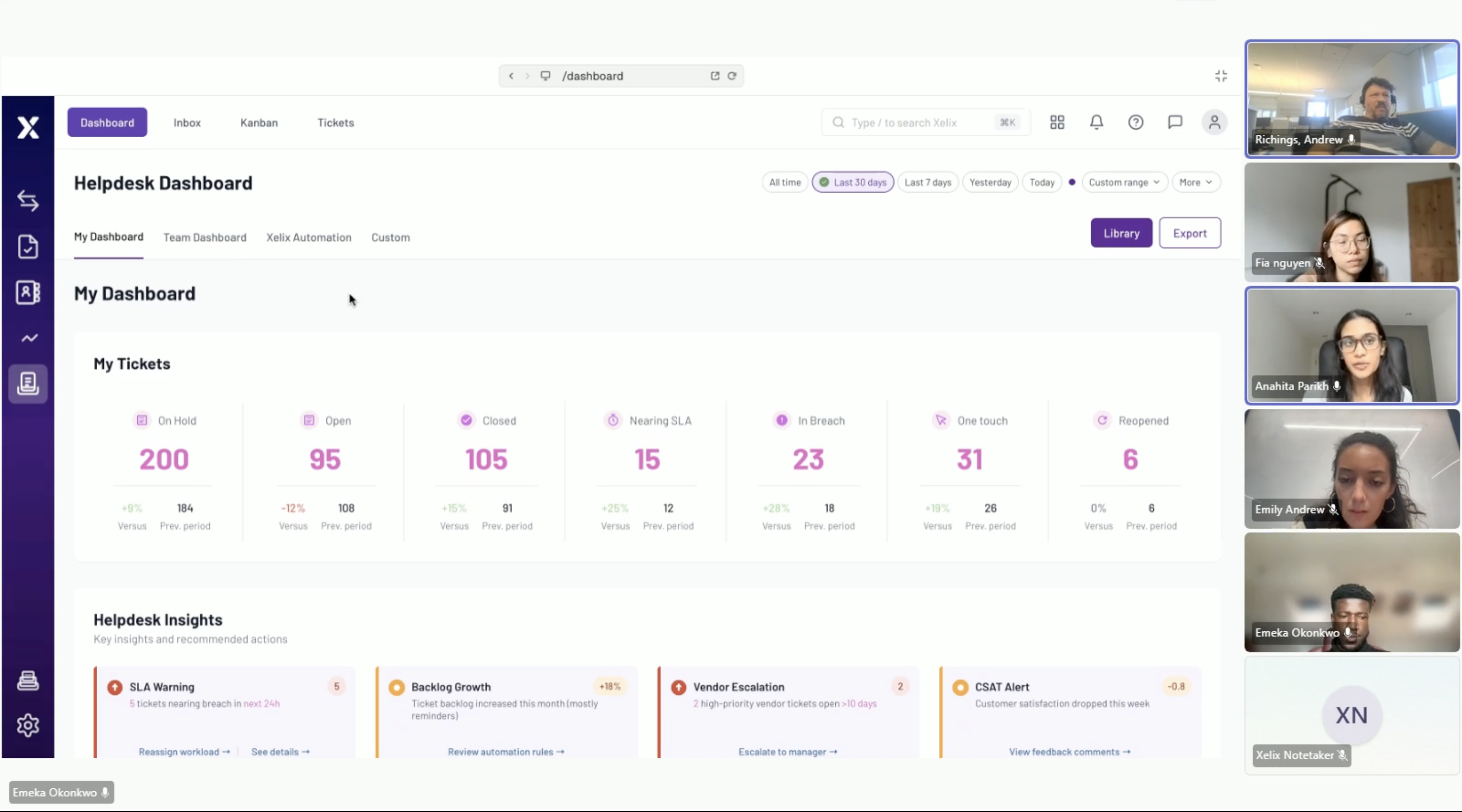
Helpdesk is Xelix's AI-powered shared mailbox for Accounts Payable teams. I led the redesign of the reporting dashboard to make it easier to scan, more actionable and a more valuable starting point for the day.
[001] CONTEXT
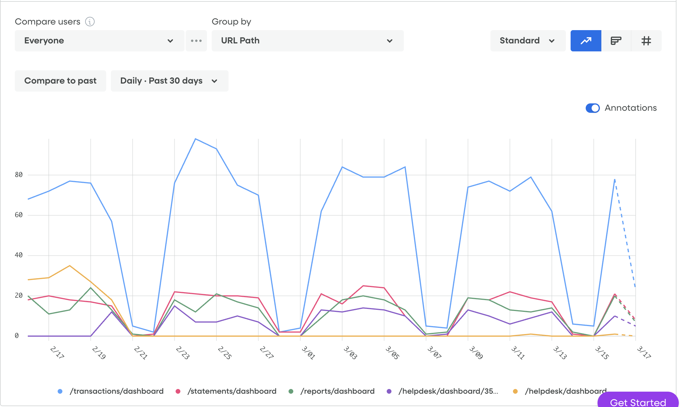
Page usage
Data from FullStory
[002] PROBLEM
[003] DISCOVERY
[004] EXPLORING THE DIRECTION
The existing dashboard prioritised flexibility over consistency, allowing every user to choose, resize and arrange their own widgets. I explored whether simplifying the experience would create more value by introducing a global filtering system, reducing visual clutter and replacing personal dashboards with a curated set of metrics informed by both customer needs and product priorities.
Alongside this, I proposed surfacing contextual "Next Best Actions" beneath charts, helping users understand not only what had changed but what action they should take next.
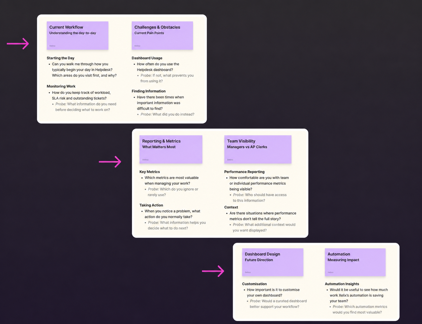
[005] CUSTOMER VALIDATION
I interviewed eight customer organisations, running separate sessions with AP Managers and groups of AP Clerks. These interviews validated the overall direction and helped us understand which metrics customers actually wanted surfaced on their dashboards, including greater visibility into the impact of Xelix's automation.
The research also revealed clear differences between user groups. Managers wanted greater visibility across their teams and supported a shared operational dashboard, while clerks were uncomfortable with individual performance comparisons. They explained that factors such as vendor complexity, workload allocation and ticket type meant metrics alone rarely reflected performance fairly.
These conversations raised important questions around privacy, context and workplace surveillance. Rather than treating metrics as objective measures of performance, we recognised they needed sufficient context to support decision-making without encouraging unfair comparisons.
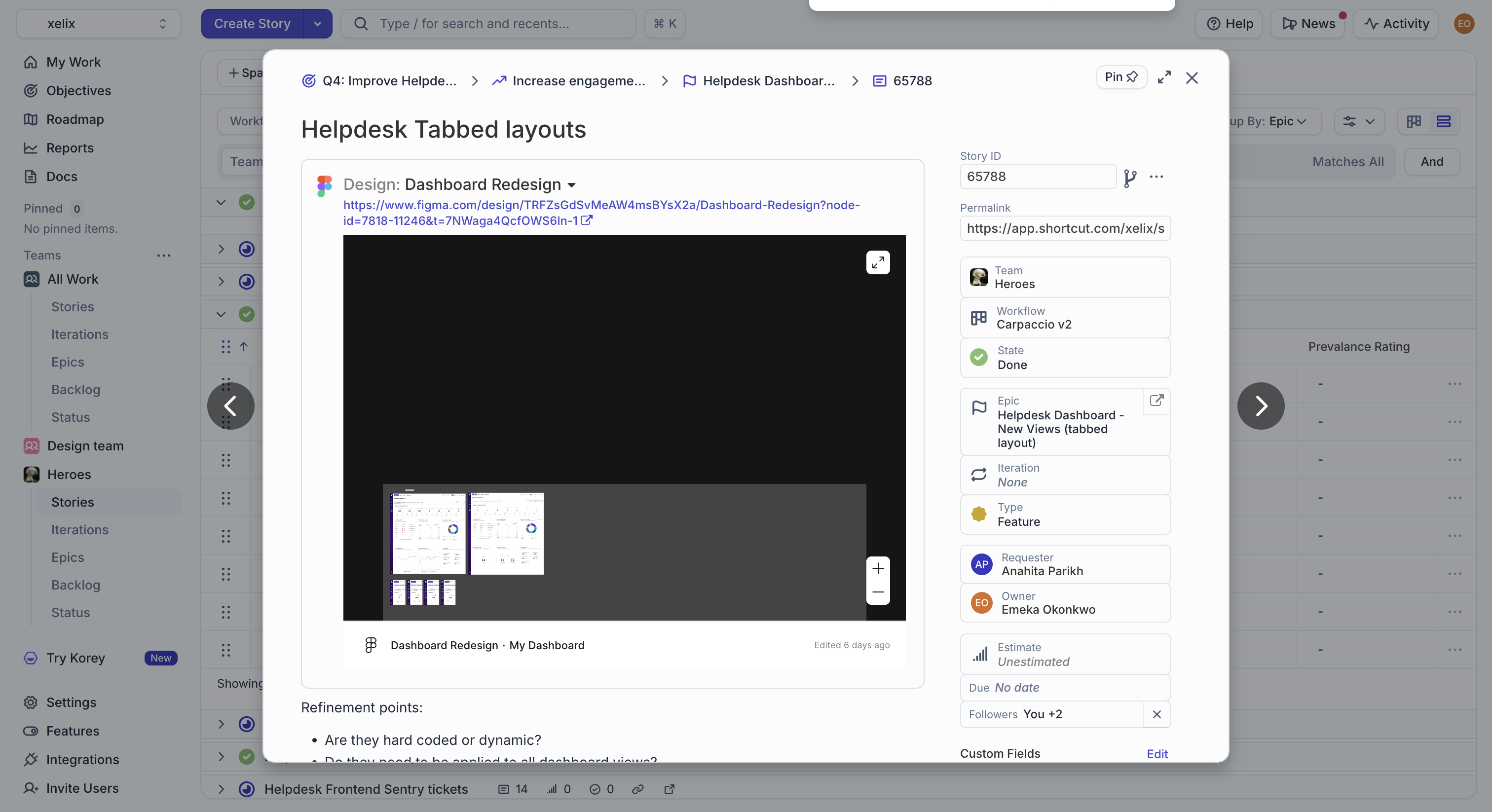
[006] ENGINEERING AND PRODUCT TRADE-OFFS
The research challenged several of our original assumptions and led to a number of product decisions.
Some customers still valued the flexibility of building their own dashboard, so rather than removing customisation entirely, we compromised by separating operational reporting from personal experimentation.
We also revisited how performance data should be shared. The original concept proposed a Team Dashboard visible to everyone, but feedback from clerks highlighted the risks of exposing individual performance without context. We renamed this to Manager Dashboard, restricting access to managers and reducing the potential for unnecessary peer comparison.
Engineering also confirmed that the platform's AI wasn't yet mature enough to support contextual "Next Best Actions", so this concept was deferred while leaving room for it in the future architecture.
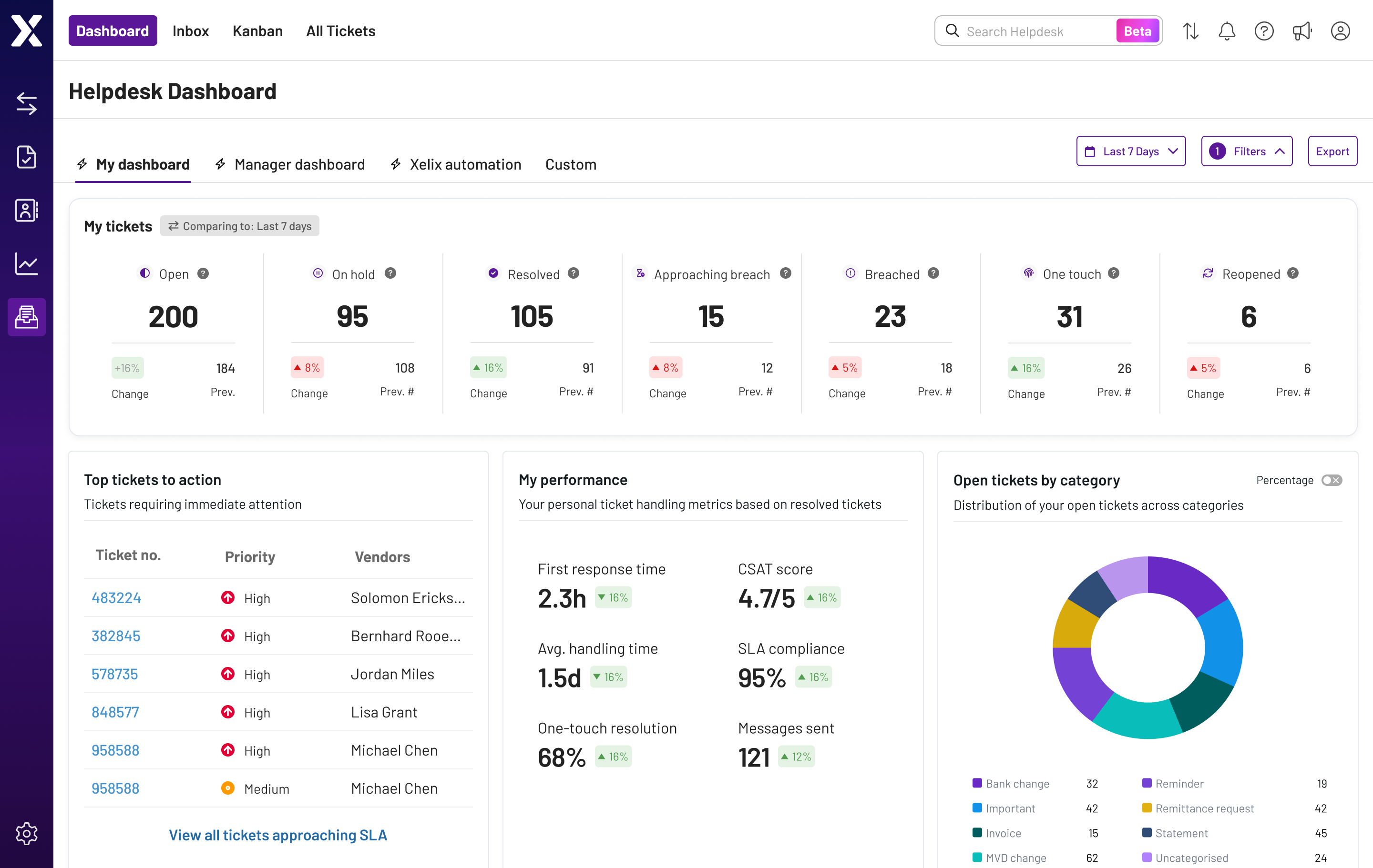
[007] FINAL SOLUTION
The final design balanced consistency with flexibility through four distinct dashboard experiences.
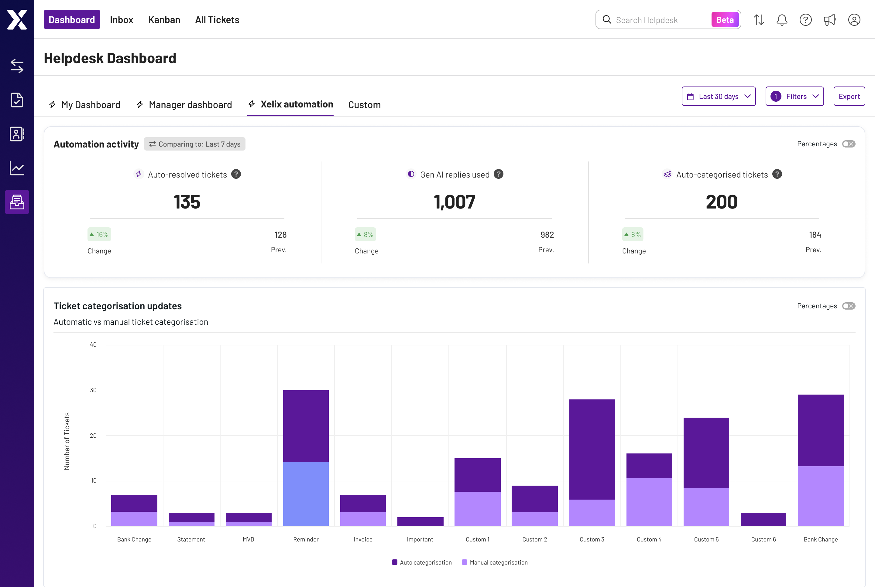
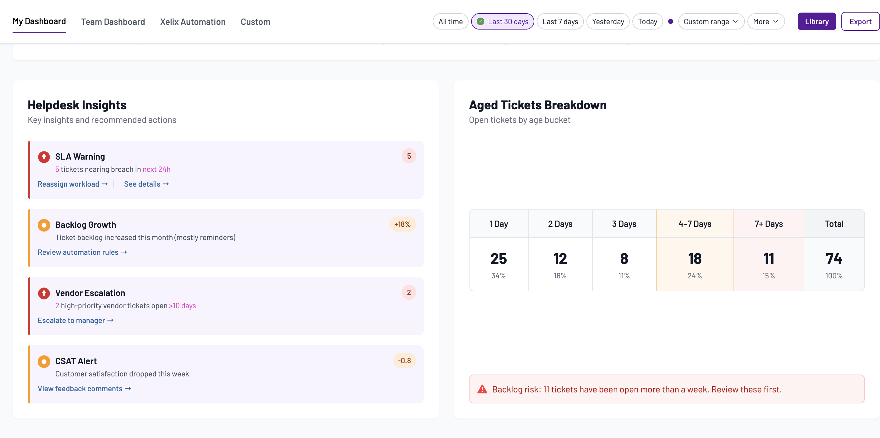
My Dashboard focused on the metrics most relevant to an individual's day-to-day work. Manager Dashboard provided operational oversight for managers while keeping individual performance reporting within the appropriate audience. Xelix Automation surfaced the measurable impact of AI and automation, giving customers visibility into the value the platform was delivering. Custom preserved a sandbox for users who wanted to build their own reporting views, while keeping the primary dashboards consistent and easier to scan.
The redesign also introduced global filters, drill-downs from charts into operational data, improved information hierarchy and inline contextual messaging to help users interpret metrics more effectively.